Tutorial for Building a Non-linear Responsive Scroller
What Will We Build
The whole title would be: Developing a jQuery powered curved-path infinite responsive scroller. But there are too many words, so lets break it down into pieces. We will build:
- A scroller;
- An infinite scroller - you can scroll both ways infinitely, when there are not enough elements on one side - we'll borrow them from the other side;
- A jQuery based scroller - we'll use jQuery selector, animation, sizes retrieval and css setters;
- A scroller with non-linear/curved (easeInSine) movement path;
- A scroller with non-linear (easeInOutBack) easing;
- A scroller which can be scrolled by clicking on arrows or on elements itself;
- A scroller with each element having 2 images: default and active;
- A scroller with central element with different styling (active element);
- A responsive scroller - on page resize it will adjust number of visible elements and spacing between them.
To make things more clear we’ll build this:

Planning and Building HTML/CSS Skeleton
You may start building a scroller in many different ways, but it seems to be easier first to do all HTML/CSS so to be able to see visual result first, and then work on JS part.
This can be done in many ways, but one of the most popular (and probably efficient) is to have one container of fixed sizes with overflow:hidden and inside of it another container which fits all the elements in one row. Inner container is positioned absolutely in relation to its parent.
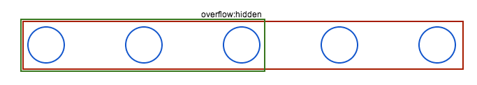
In following image red rectangle is inner container. Green rectangle is main container. Inner elements are depicted as blue circles.
It is an efficient solution because while scrolling we have to change only inner container left value. Other solutions would imply to manipulate with each element independently but it is cumbersome and it is very likely to have unsynchronised animation where some elements will move faster then others. It will look awful.
All the other things may be done in whatever way. But one important thing is to keep elements horizontal margin unset because we’ll use these margins to balance elements to fill visible space evenly.
In following examples I’ll use only 2 images: default and active, but in real world version you can set custom images for each element.


For me the final result of HTML+CSS looks like:
Adding Responsiveness
In order to make our scroller responsive we have to do following things:
- Find max available visible space;
- Compute how many odd elements may fit in visible space;
- Compute what should be the spacing between fitting elements in order to fill whole visible space;
- Set margins for elements based on previous point;
- Update inner container width to fit all elements in one row.
Here are 2 things to mention:
- All these steps should be performed whenever main container width is changed (on page resize);
- We need odd number of visible elements because in our case scrolling arrows should be around central element, so it should be only one central element.
By doing all these things we’ll end up with something like this:
Here are few things to mention:
- Inner container width is set as 150% of minimum necessary to fit all elements in one row. It is done in order to have some free space for elements that we'll clone and add into container on later steps;
- We didn't create a classical jQuery plugin, we'll have just 2 functions and some variables. But it may be a good idea to transform this thing into a plugin if you want to reuse it or maintain.
Adding Basic Scrolling
In order to add basic scrolling we have to calculate new inner-container position and scroll to it. Also here we’ll add hooks for onclick event. When clicking on arrow - scroller will move by one position. When clicking on element - scroller will center given element. The code for it may look like:
In fact this example works not really well when using arrows as it doesn’t keep track of current position. But as for now we’ll ignore it as we’ll overcome this in next step. Also as you can see if you’ll click on element from edge then you’ll end up with empty space on the side of this element. In plugins without infinite scroll it is there is a limit on scrolling so that you’ll not end up with empty space. In our case we’ll implement infinite scrolling so we’re going to solve this next.
Infinite Scrolling
Infinite scrolling is done quite easily - when there are not enough elements on one side, before scroll starts elements from the other side are cloned and after scroll ends clone originals are removed. It is also possible to optimise this process by repositioning elements when needed (if it possible) but it adds complexity so we’ll skip this step. In fact we’ll always clone elements so we don’t have to check if we need to clone elements. Also this way we don’t need to keep track of scroll offset as it will be always 0.
It may be implemented like this:
You may see now that scrolling is working perfectly. In fact now we have a basic infinite scroller. There are lot of them on internet if you want to see other examples. So what we did in this step is:
- If scroll to:
- left: clone last X elements and prepend them into inner container, offset inner container with the prepended elements width so it will look like with no changes;
- right: clone first X elements and append them into inner container, compute animation offset;
- Animate scrolling using css' left property:
- left: animate to 0px;
- right: animate to previously computed offset;
- On animation complete:
- Remove clone originals;
- Set scroller left offset as 0px.
Add active elements
To match given template we need to style centered element differently. For this I previously added a different CSS rule for elements that have active class. We only need to add active class to centered element and remove it from previously active element.
Add custom scroll function
For animation we used built in swing function that is build in jQuery. There are many others built in jQueryUI, and we’ll use 2 of them: easeInOutBack and easeInSine. In order not to add whole jQueryUI we’ll extend $.easing object with necessary functions. This way we can add any animation function we need.
Add vertical movement
Now let’s get our hands on non-linear part of scroller. If you’ll look closer to provided template you’ll see that elements that are in the center are pushed a little bit to bottom. To be exactly centered element has a 30px top margin. It will be good to keep the same virtual curve line of elements while it is scrolling. In order to do that we’ll use step animation function which is called for each CSS property on each jQuery animation step. As first argument this function receives CSS property value. It should look like:
In order to see how it looks with 5 elements or more (depending on you screen size) open this example or you can open JSFiddle and add more elements.
What we did here is:
- Define a maximal top margin (30px in our case);
- Use a easing function which matches our virtual path (easeInSine in our case);
- On each animation step compute each element top margin.
One animation at a time
If your’e insistent enough you managed to click fast multiple time on an arrow. You may see that there is a problem with that. This is because we don’t keep track of animation state. If we wouldn’t use cloning and adding new elements into our inner container then we could simply set animation’s queue parameter as false. This would stop active animation if a new one would be requested.
In our case we’ll simply use a lock - a boolean variable which will be checked before starting animation. If lock is active this means that there is another animation performing and we’ll do nothing. It lock is free then we’ll activate lock, perform our animation and we’ll release the lock when animation will be finished.
This is one of simplest solutions. Other variations would have a queue so that if an animation lock is active, next action is sent into queue. When animation is done, it is checking for queue, and if there is something - it is executing it. We can even get rid of lock, push all animations requests in queue and use queue length as lock.
Using CSS3 Transitions
In order to make use of built-in-browser animations accelerations we may use transition CSS3 property. But there is a problem with that - there are limited number of default timing functions. However there is cubic-bezier timing function which allows building custom functions. An example of function that is approximately like easeInOutBack is cubic-bezier(.6,-0.37,.43,1.36). Such approach will save us some code and should work much smoother on many machines.
Here you can see that CSS3 transition was added to inner container that has transition class. It was done in order to be able to change inner container offset instantly after we prepend new elements. But now we lost top margins. So we’ll do the same for margins: we’ll use the same transition function and we’ll set only final margin so browser will compute for us all animation steps.
For compatibility it is possible to combine both methods (jQuery and CSS3 animations).
Other Optimisation Techniques
There is still room for experimenting and improvements. One of such improvement may be usage of requestAnimationFrame for smoother jQuery animation. Other improvement is cloning elements only when needed.